
The colors I use in my work
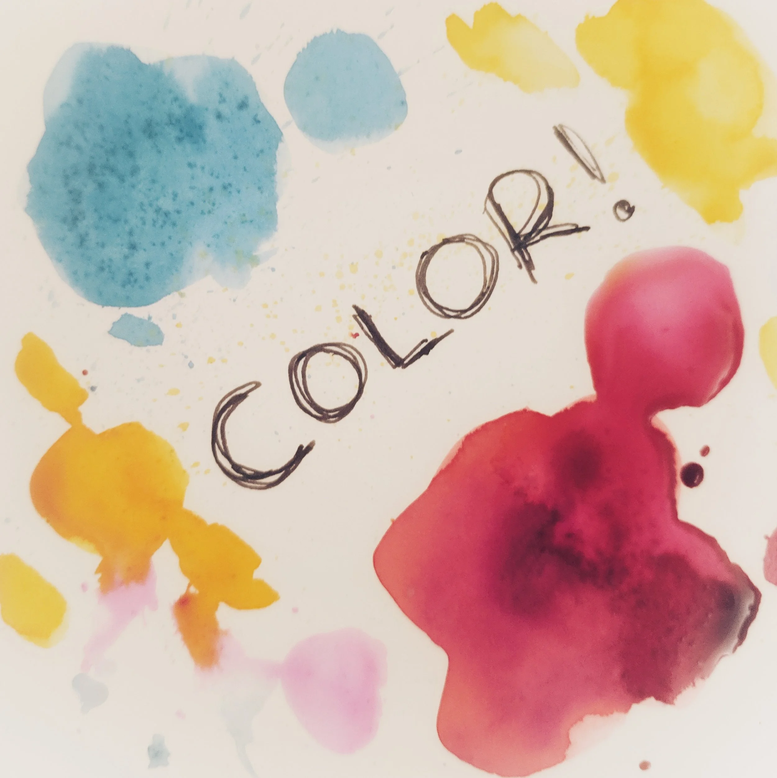
If you haven’t noticed from looking at my work, I am absolutely in love with color.
Moving richly pigmented oils around on my canvas, layering, and blending tones. It’s something that brings me so much joy. I choose to paint my figures in vibrant colors because I truly believe that humans are vibrant beings and I want to depict that. And to me, there is nothing more beautiful than cool, deep blues, sunshine yellows, and warmly glowing reds.
I start with primary colors as my base palette, and adjust based on the specific feel I’m looking to achieve with that particular painting and subject
A yellow - often cadmium yellow light, naples yellow for a more muted tone
A red - cadmium red light is a favorite. so is crimson. For a poppier look - i’m obsessed with permanent rose - a happy hot pink
A blue - ultramarine, pthalo, or even prussian, depending on the tone of the piece
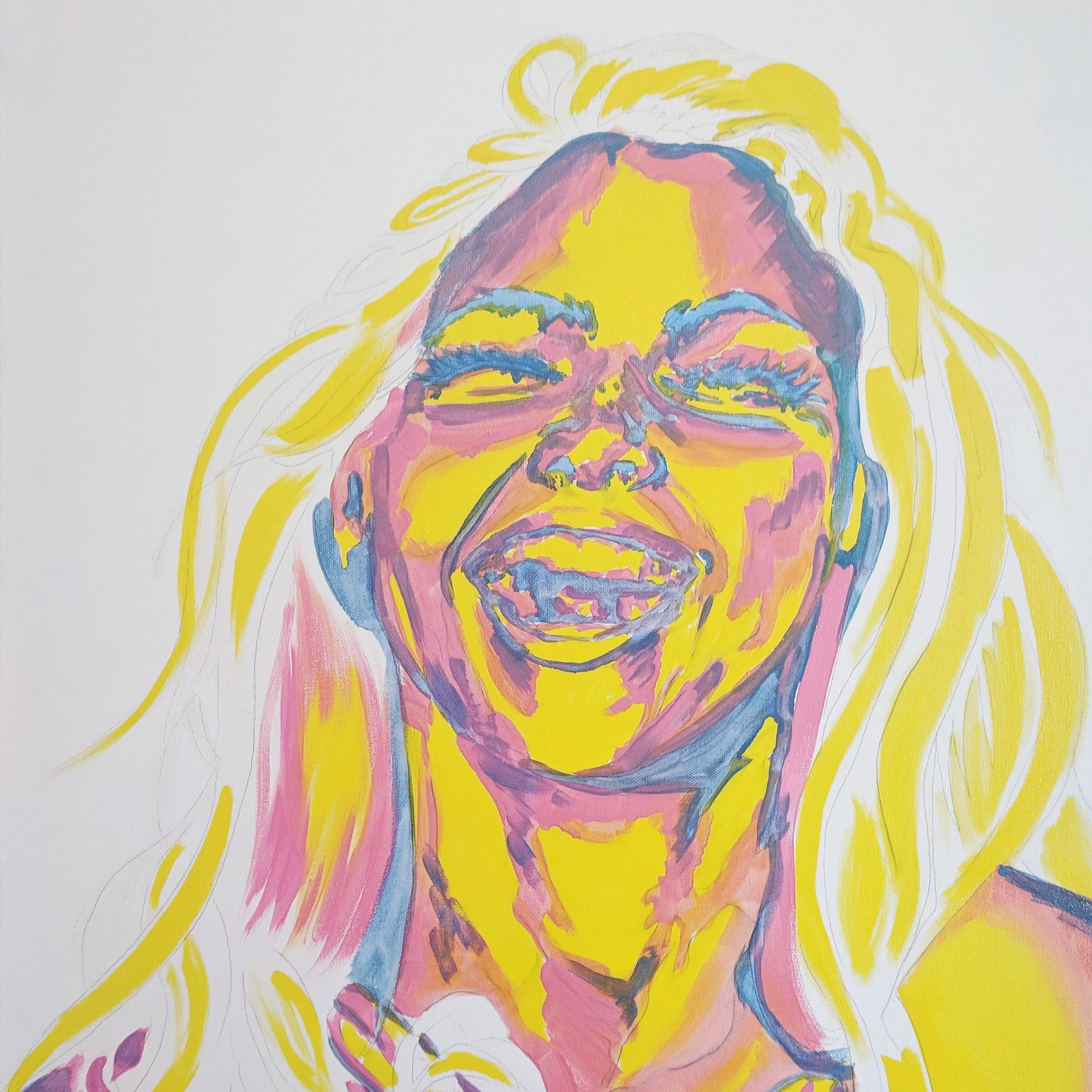
Underpainting from a new work in process. Go ahead and laugh! She is!
I block in my underpainting with three, or occasionally four, base colors, creating the light, medium, and dark tones of the figure.
The final stage of my paintings involves a lot of intuitive color placement. I will generally pull out a palette of pigments that will best complement the work and create the look I’m aiming for, sometimes mixing a few specific tones myself, and then I apply them expressively and with as little conscious thought as possible. I feel that this is where the magic happens, and where I really enter into flow state.